Neried magazine is a space for women to celebrate surfing and paddle boarding no matter their skill levels. Named after the Ancient Greek Nerieds, the concept aims to bring power back to women in and out of the waves.
Submitted as part of a University module, this project is a proposal
for the magazine series and social outputs in the ways of concept,
form, business and design.
About Neried magazine
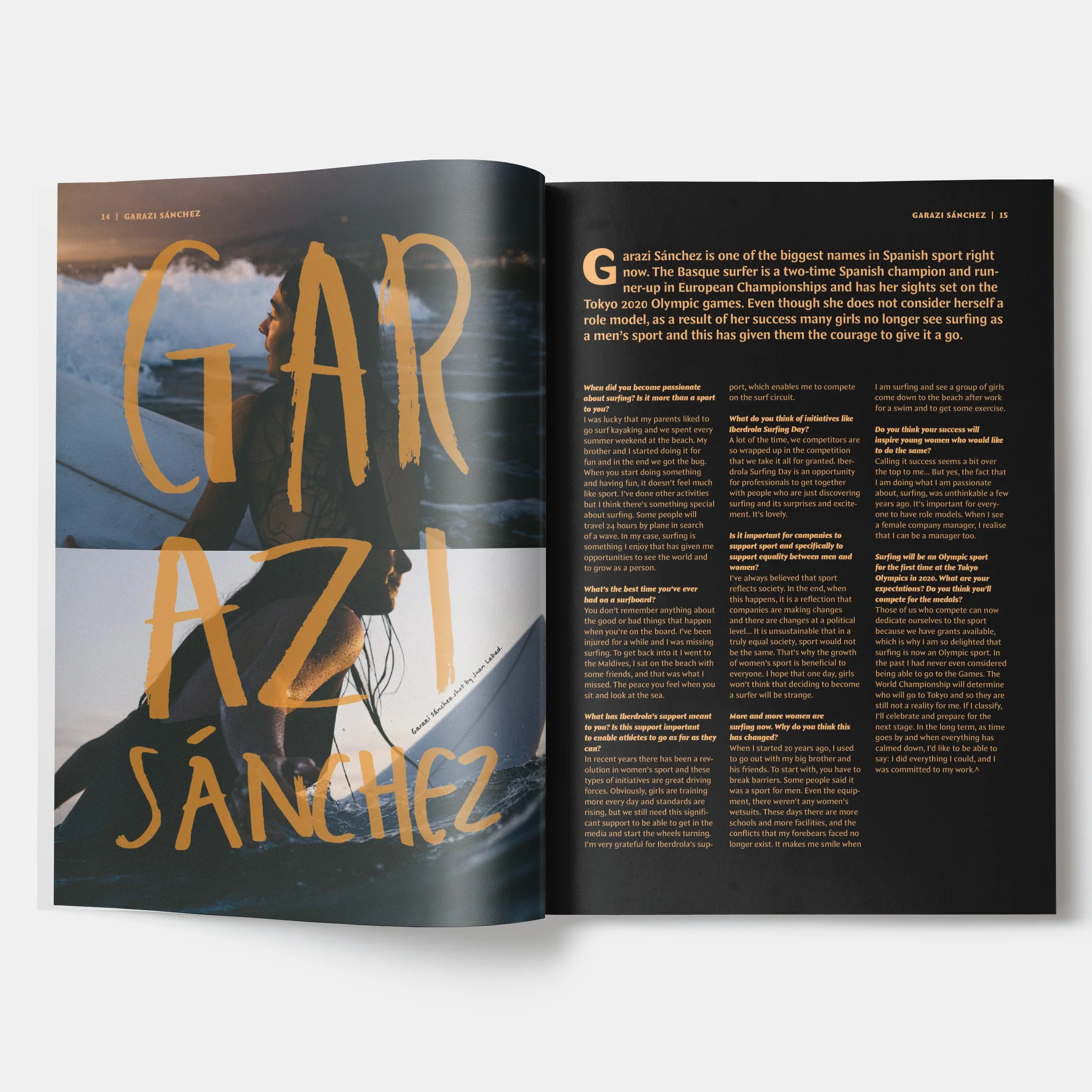
Neried Magazine is the space for female surfers to share and celebrate stories outside of pressure from the male lens. Surf magazines focus almost exclusively on male surfers, to be featured as a woman, you must be at the forefront of women’s surfing and achieving highly. Neried is a space to celebrate smaller and more achievable goals, as well as the achievements of the athletes at the top of the sport. Surfing is much like life – unpredictable, challenging, and rewarding. Neried is the place to resonate and connect with like-minded women, experiencing similar feelings.
To be a Neried reflects on ancient Greek mythology, calling to the goddesses of the sea’s rich bounty. Escape from male created and dominated spaces, guiding you through the complexities of modern femininity, reminding you that, like the Nereids of old, you too possess the strength to weather any storm.
Neried is an important outlet for female surfers as well as community. It so often is the case that women are disregarded on the waves as they are in society more broadly, and it can make achieving and feeling comfortable in the surf community a challenge. Neried is the attempt to destroy this barrier, and give readers the platform, support, and community to thrive in.
The design
The design of Neried focuses on reframing stereotypical surf imagery and culture.
Typography
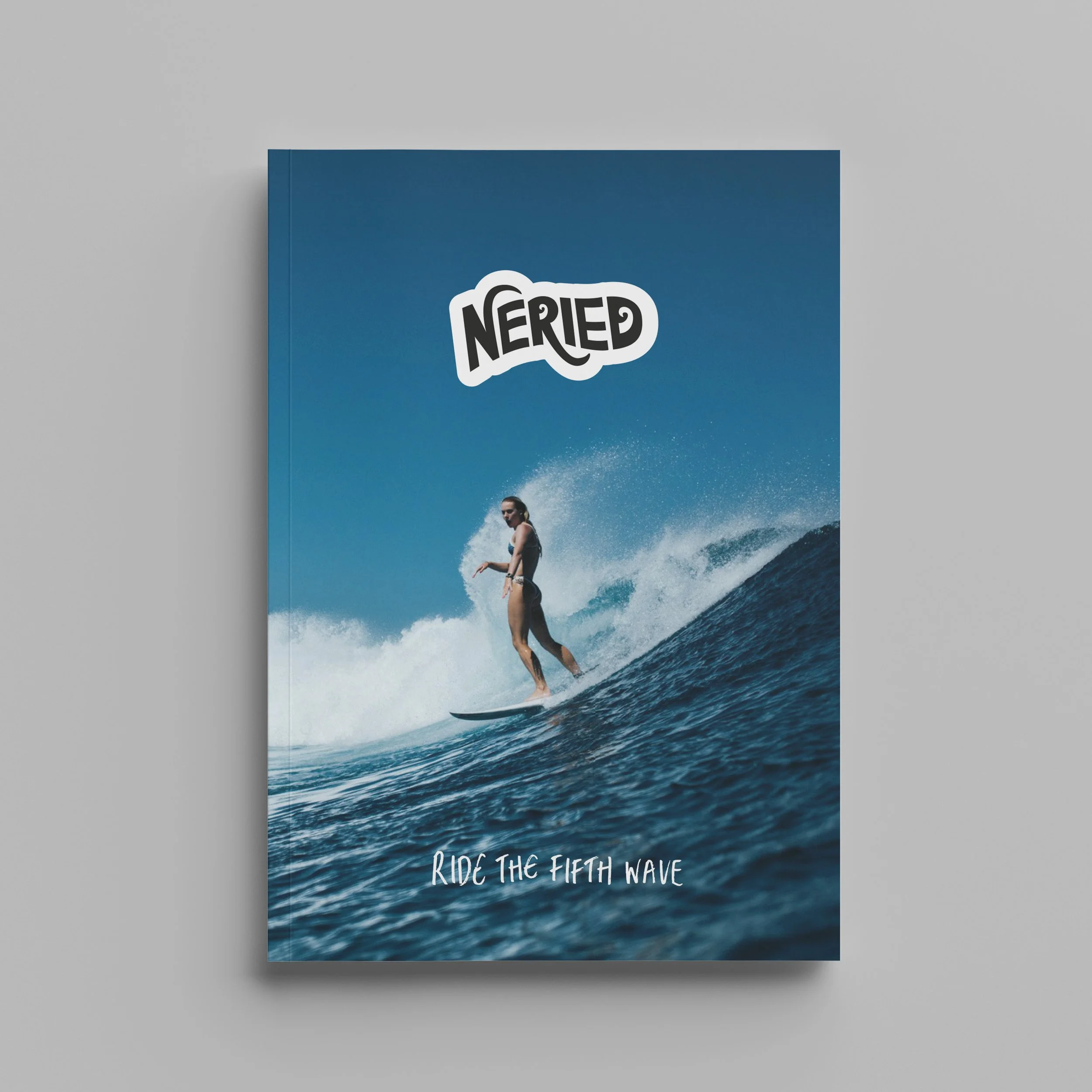
The magazine masthead, also doubling in use as a vinyl sticker, is hand drawn, inspired by surfboard fins and wave forms. Article titles and pull quotes are bold and hand drawn, inspired by vintage surf and beach store hand-lettered signage.
Colour
Inspired entirely by an oceanic palette, this magazine is largely pale shades of blue with occasional splashes of pink and orange, symbolising the reflections of sunsets against waves. Feature and hand-lettered text are a solid black, impactful against the soft hues across the pages.
Imagery
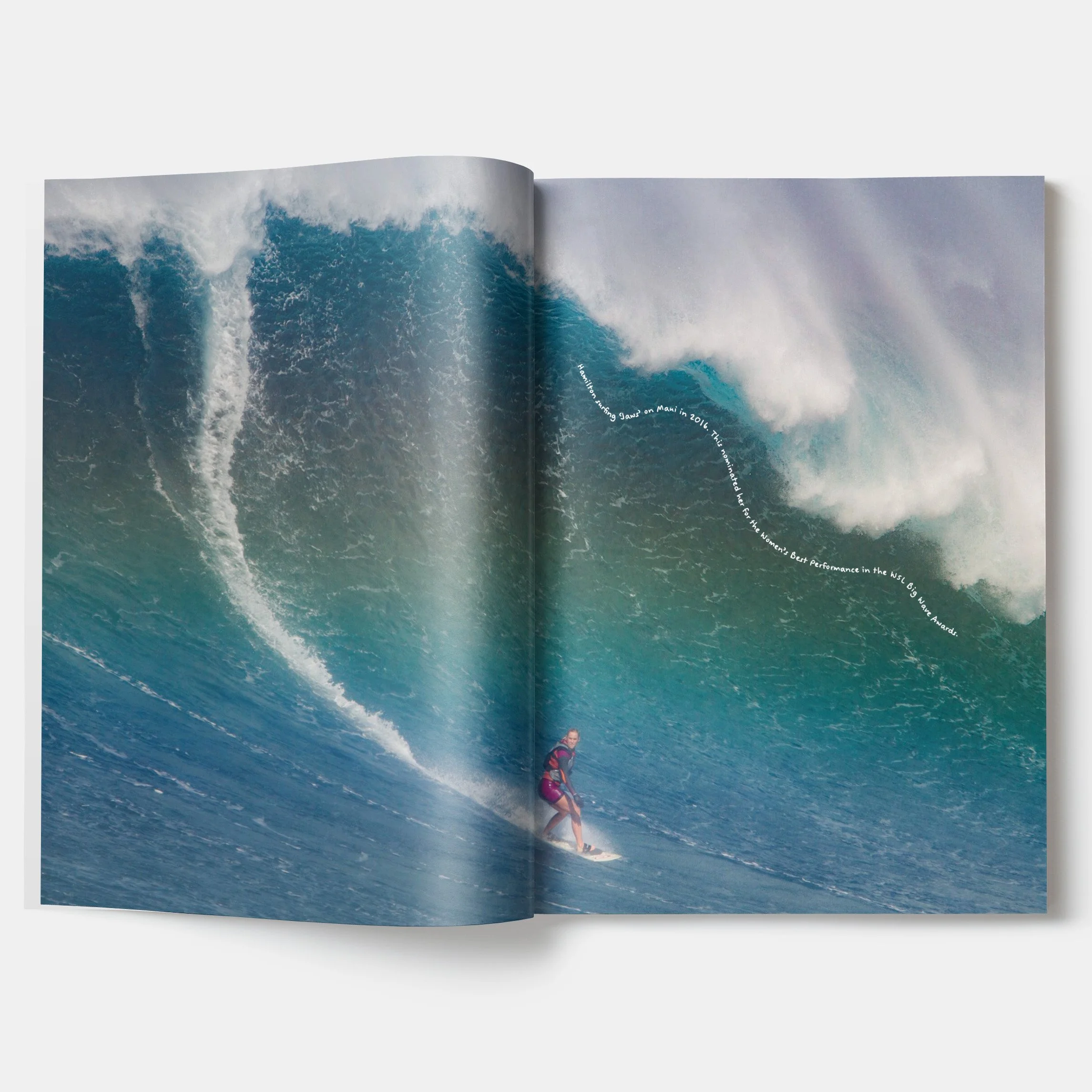
Neried focuses on the individual, rather than the masses. Intimate photography and interviews aim to build a close and warm community, welcoming everyone into the at-times exclusionary surf space.
Layout
Spreads chop and change between impactful images to quiet and tranquil pages, reflecting the ebb-and-flow of waves against the shore.
Digital assets
It all begins with an idea. Maybe you want to launch a business. Maybe you want to turn a hobby into something more. Or maybe you have a creative project to share with the world. Whatever it is, the way you tell your story online can make all the difference.