

Designing a student film poster
Delivered in my final year of studying at the University of Reading under supervision of
Greg Bunbury, this real brief from 2023 focussed on the design of a student short film, ‘Pieces’.
Brief
The short film ‘Pieces’ focusses on a young woman, Carmen, who moves away from her family and old life to pursue artistic endeavours. Her friend, later revealed to be a figment of imagination, coaches her to achieving her dreams and letting go of her past. Cinematic influences of the writer included Thelma and Louise and The Virgin Suicides.
The student crew team highlighted the importance of femininity and isolation within the film, as well as transition into adulthood from a troubled youth. In our first meeting, the team had a pitch-pack prepared, with colour stories and multiple mood boards showing ideas for characters and sets. Their primary film aesthetic inspirations were the 1990s and 2000s, with a focus on clutter and muted colours.
Logline: ‘Carmen leaves her small-town life behind for the vast city to find a sense of identity. In doing this, she tackles the good, bad, and ugly areas of womanhood, femininity, and family expectations.’
Research
High budget films and franchises frequently use photography to display the characters, who are often recognisable actors and actresses. This is a sensible decision when the success and box office sales can be driven by familiar faces, however in the context of independent student films this is not necessary. Hierarchy in typography similarly reflects the drive to sell tickets in recognition of directors, production companies and stars. The freedom from these factors allows for a different approach to typography because of the difference in motives; the goal for this poster is to capture and communicate the essence and themes of the film, rather than names of personnel. Illustration is less commonly used across this genre in comparison with other styles of film.
Short film posters rely less on the notoriety of the people involved but take a similar approach to typographic styles. Images tend to appear more intimate than those of high-budget films: closer cropping on faces and focus on a single person are the key takings when looking at a large number of posters. The imagery must work harder to attract viewers than high-budget/feature-length films with their large promotional campaigns. In turn, image is typically the focal point of short films.
Development
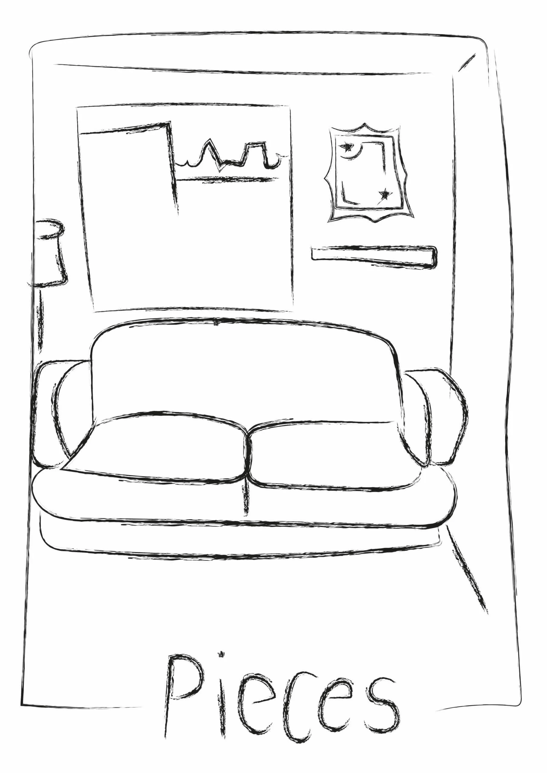
The first developed sketch from the initial sketches (and the agreed route by students) focussed on representing the protagonist in a lonely, solemn manner and adding surrounding detail as a nod to the ‘chaos’ the students wanted to portray.
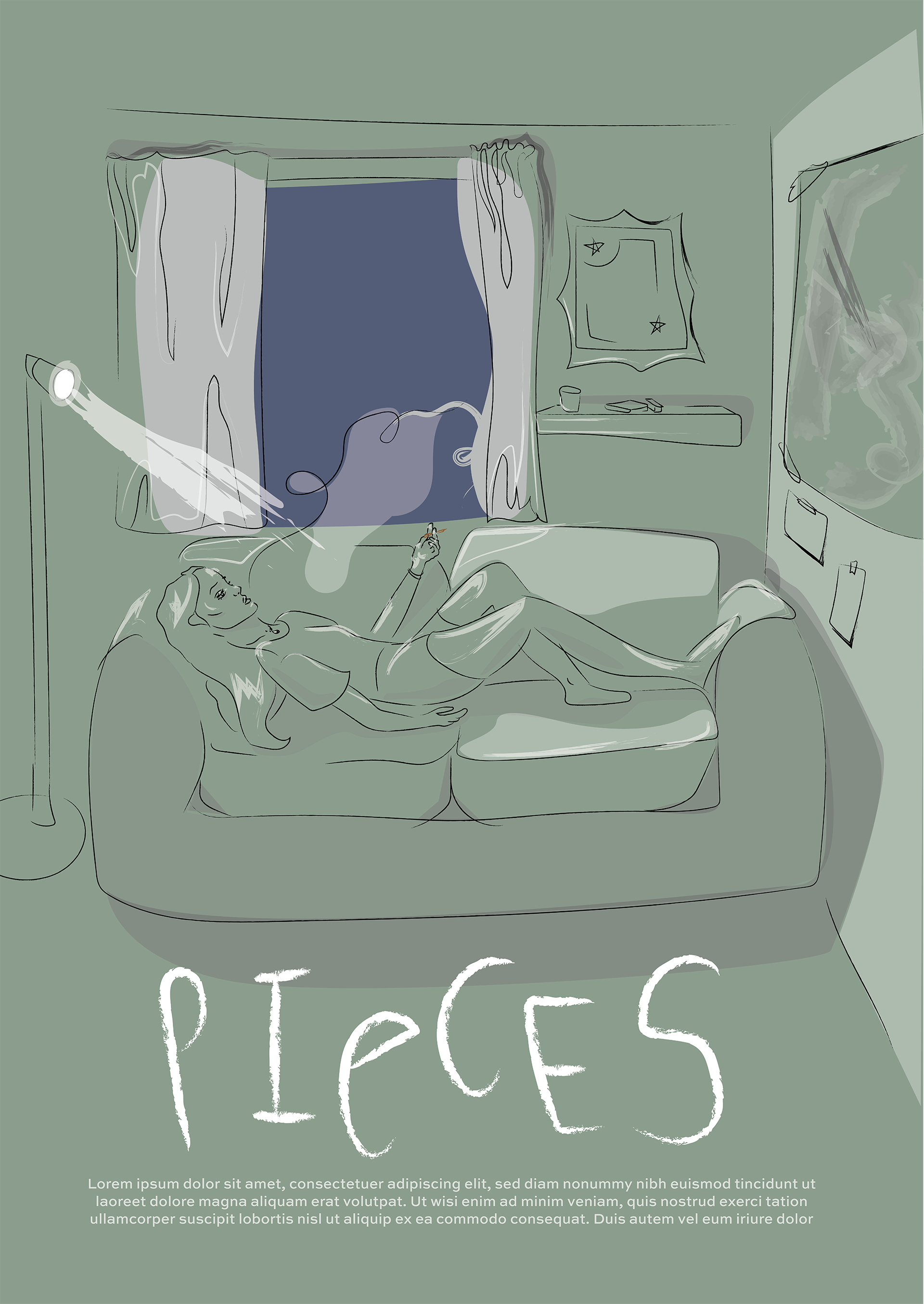
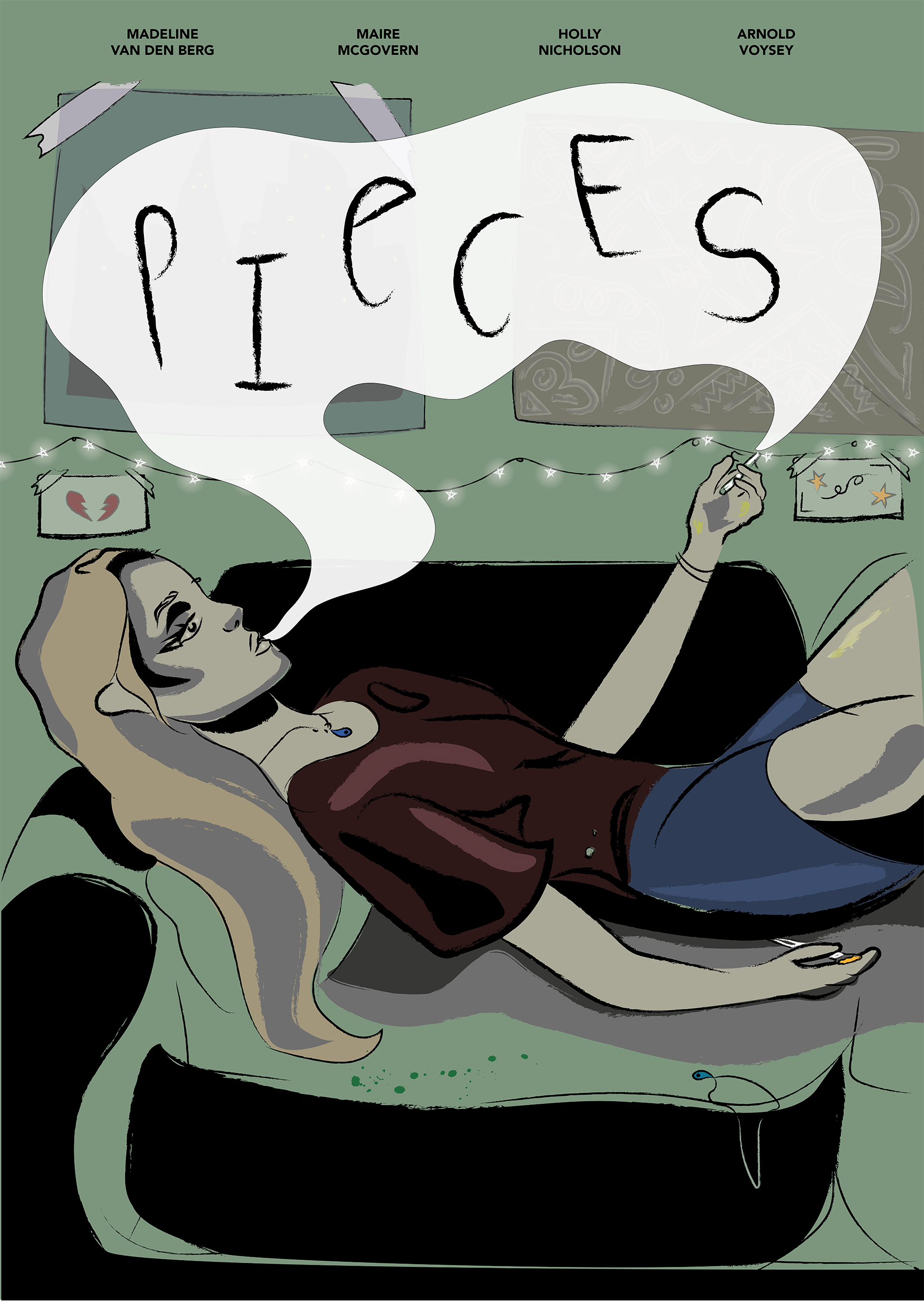
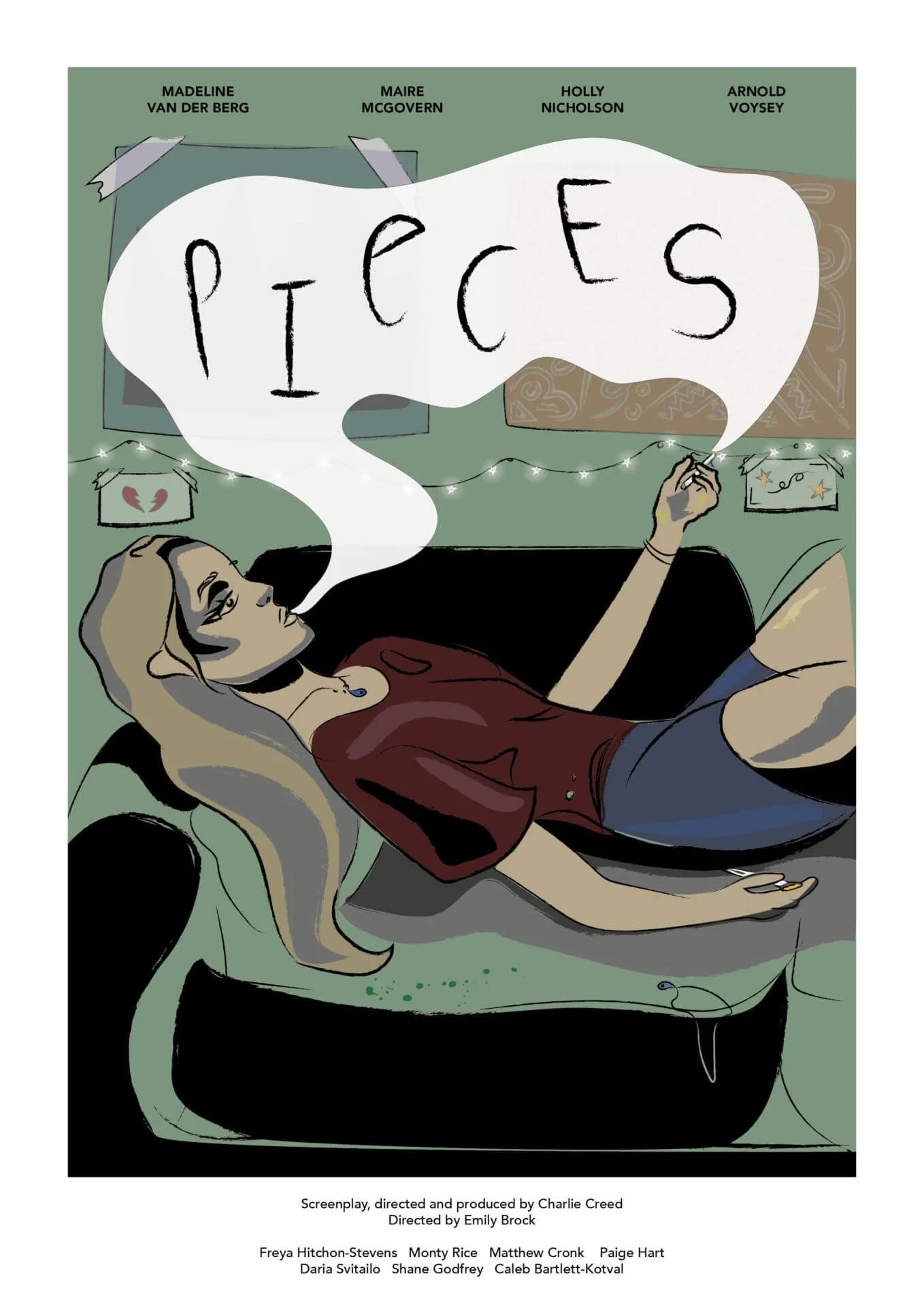
My supervisor provided some stylistic guidance and suggestions to help create drama and depth to the illustration. The use of black and textured materials create a depth, and facial features are far more exaggerated.
Changes were made to reflect the received feedback from Real Jobs meetings, client, and supervisor feedback. Adding back in small details of paint on the character’s thighs and ying-yang necklaces brought life back into the illustration. The colours were selected with consideration to the client pitch-pack, and palettes within the film. The students asked for all the crew to be names on the poster, which pushed the poster in a more text-heavy way than I had originally planned for within the illustration. The suggestions to frame the illustration later helped to resolve this issue.
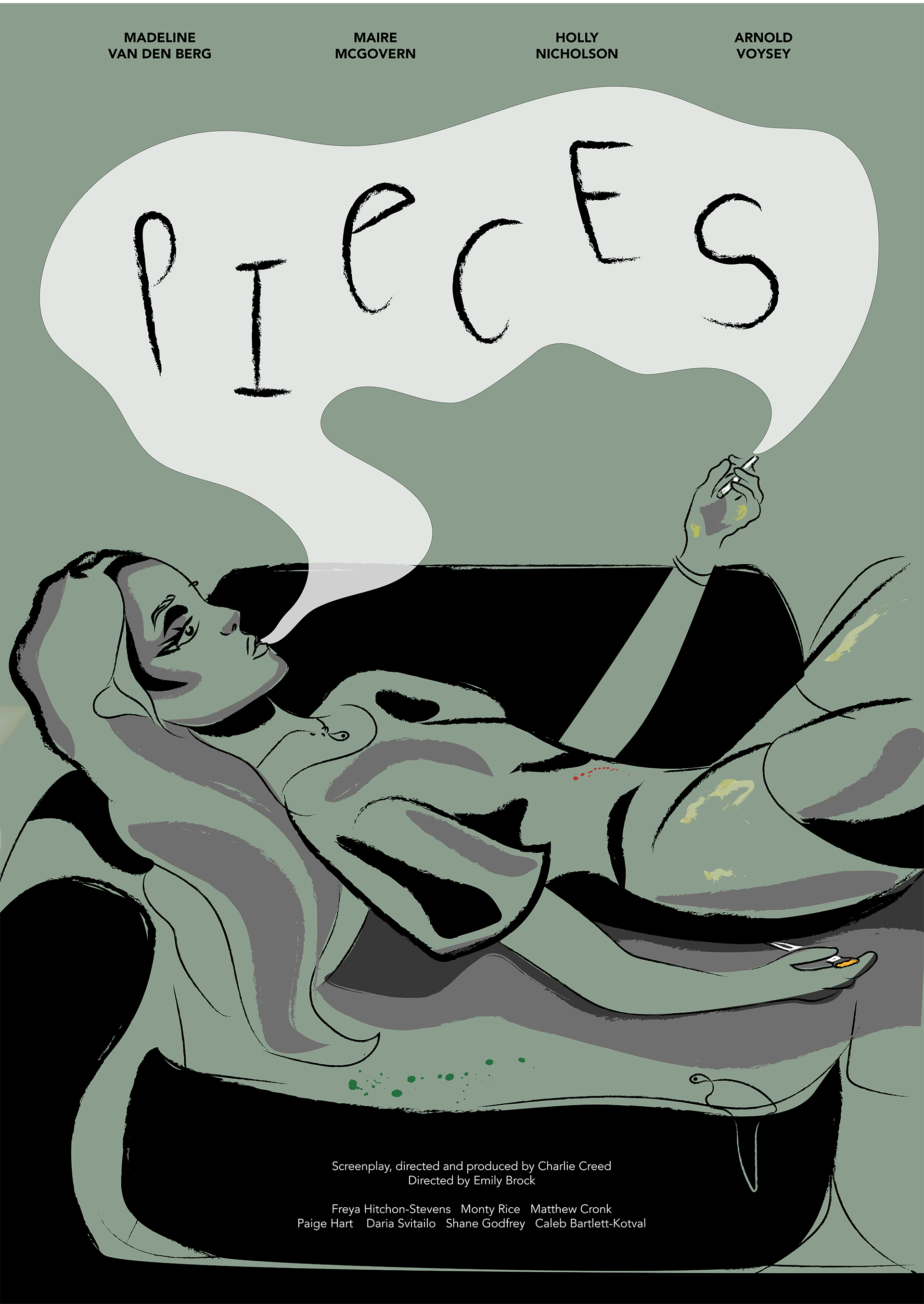
Outcome
For the full, detailed report on this project, you can read the blog post I wrote here
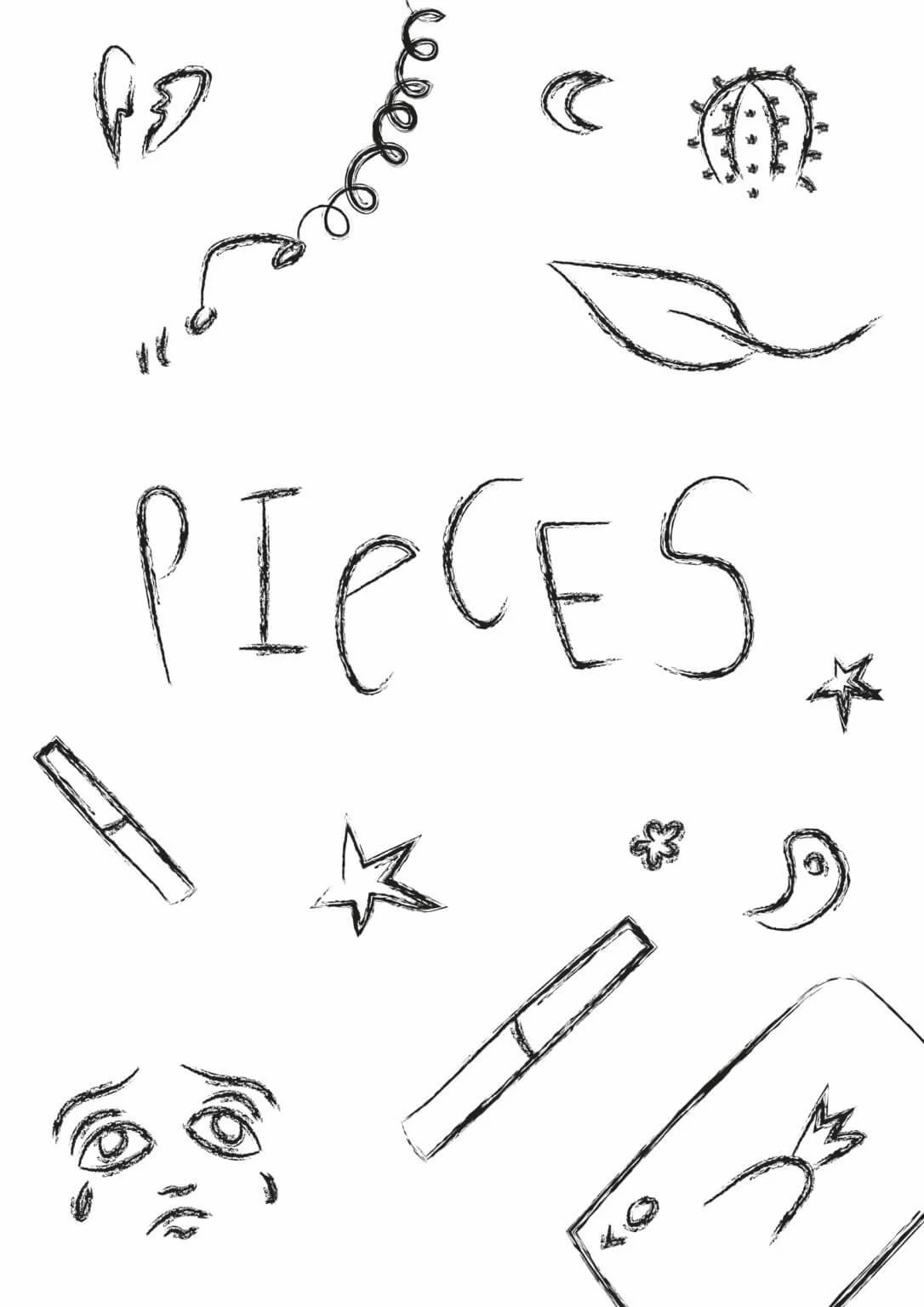
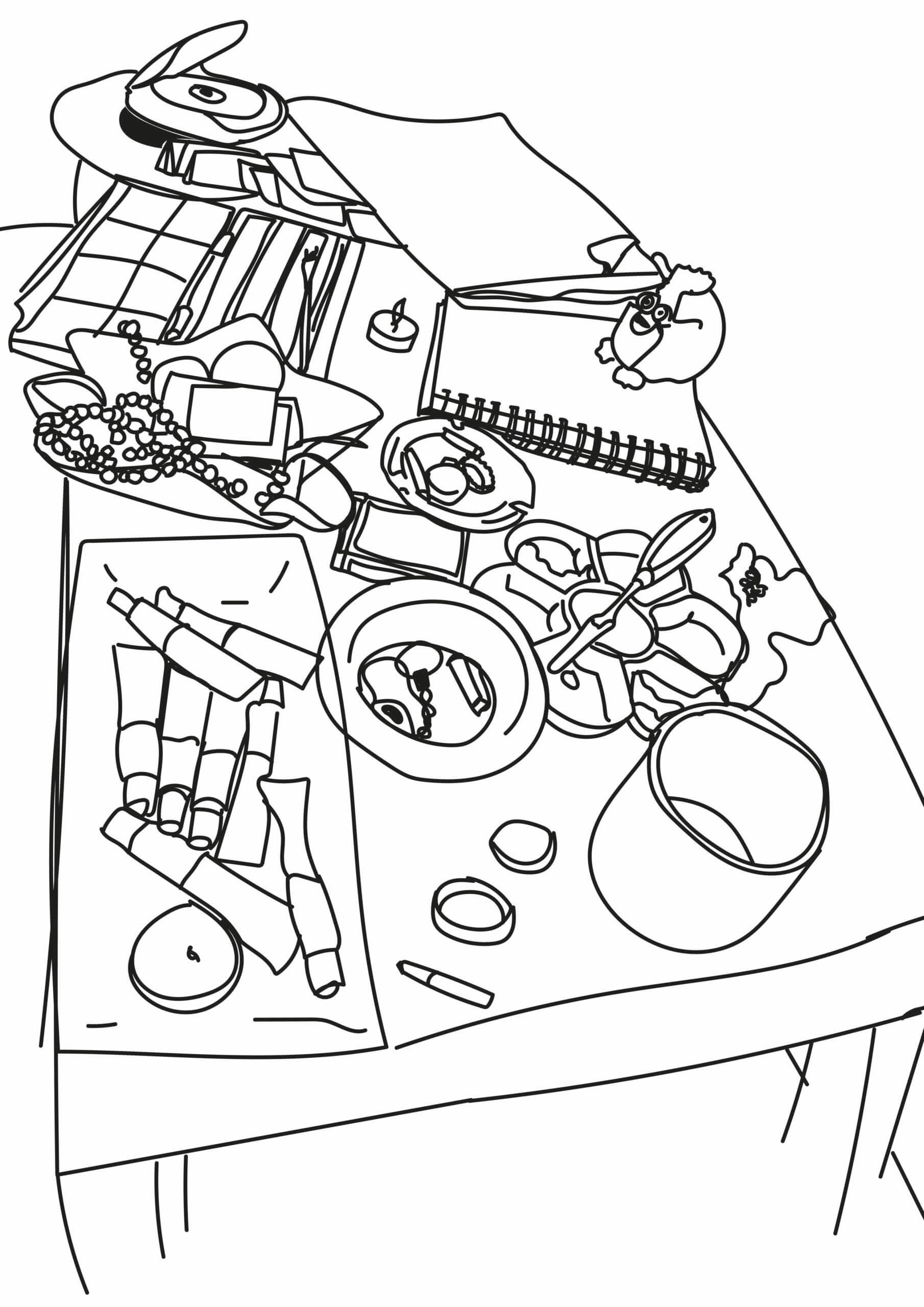
Sketches
Discussions with the clients of their wishes and ideas led to initial sketches representing the chaotic nature of the protagonist. The clients wanted a style which reflected the artistic themes. This considered, we agreed that illustration rather than photographic / typographic approaches would be most appropriate. These following illustrations represent initial conceptual ideas.
The provided pitch pack referenced ‘outdated’ media and cultural references (Furbies, CDs and LPs…), captured in the sketch of the table. Using reference location shoot images, the student group enjoyed the chaotic line textures and representation of clutter in the protagonist’s life.